SUS Project
LOGO DESIGN FOR MUSIC COLLECTIVE
PROJECT OVERVIEW
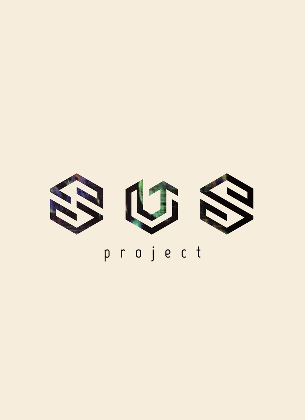
SUS is a musical project uniting three DJs, rooted in a nostalgic 90s vibe but with a modern, dynamic approach. The challenge was to create a distinctive main logo for the collective, reflecting movement, energy, and unity, while maintaining versatility for use across various promotional materials and event branding.
DESIGN APPROACH
The SUS logo is constructed as a continuous line forming the letters S and U, with snake-like movement that references the 90s gaming and playful aesthetics—a formative period for all three DJs. The line is constrained to 60° angular turns, aligning to a hexagonal grid, which gives the logo geometric precision and rhythmic flow. A subtle arrow within the U reinforces the meaning of “SUS” (up), symbolizing elevation and energy.
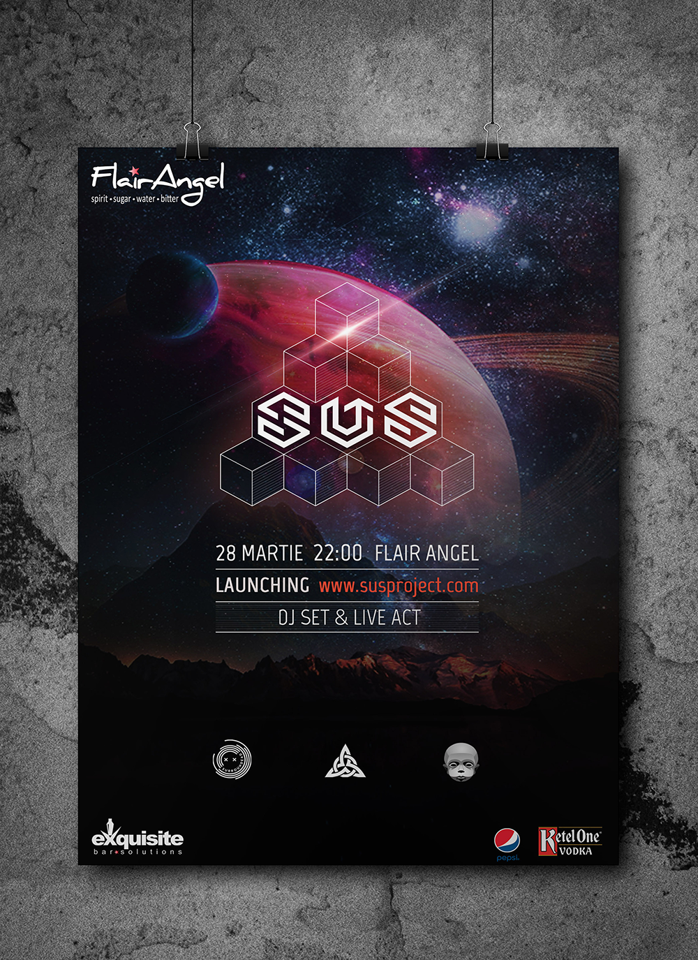
The primary color scheme is black and white, allowing flexibility, with the logo adaptable over vibrant, colorful backgrounds for dynamic event visuals.
TOOLS
Adobe Illustrator (logo creation), Photoshop (mockups and presentation)